| 60th Anniversary Logo Contest Winners |
Celebrate the Winning Designs of the 60th Anniversary Logo ContestFirst Place: Tadiwanashe Mutasa, Central Michigan University  
Design StatementMy logo design for the 60th Anniversary of the National Collegiate Honors Council was inspired by my profound respect for the history and ongoing development of honors education in the United States. As an honors student, I have seen first-hand how the NCHC has supported scholastic innovation and acted as a guardian of academic excellence for 60 years, helping countless students and teachers. The goal of my design was to pay tribute to 60 years of academic rigor, community, and transformative leadership while symbolizing the past, present, and future of the NCHC, with each design decision subtly reflecting the story of the NCHC as one of intellectual curiosity, inclusiveness, and the desire to make an impact on the world. Design ChoicesSymbols Colors Typography Preservation of NCHC Legacy Second Place: Suhani Sabharwal and Mikala Wong, Las Positas College 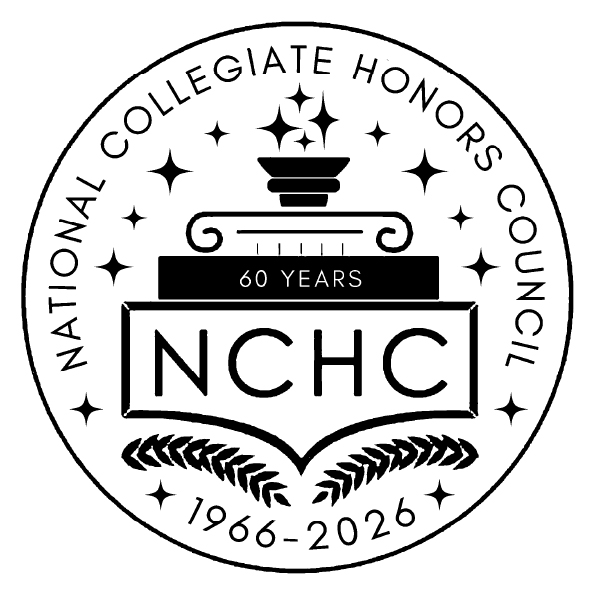 
Suhani Subharwal 
Mikala Wong Design StatementThis design honors 60 years of the National Collegiate Honors Council (NCHC) history by blending tradition, symbol, and celebratory new style in harmony. The design honors NCHC's 1966–2026 history while showing a positive visual logo that tells the organization's story of academic excellence, leadership, and intellectual growth. The design has respect in looking back at achievements and looking forward with excitement and optimism, just how this milestone anniversary does. In the middle of the design is a torch that consists of 16 sparkles that surround the logo, one for every significant milestone in NCHC's history. The torch represents knowledge, light, and the redemptive path of honor students, while the sparkles represent celebration and acknowledgment of sixty years of excellence. The color scheme is borrowed from NCHC's colors, and used so the letters and the torch are emphasized in brightness and clarity. The composition uses overlaying of colors as well as thoughtful use of contrast so that it is emphasized even further without losing professionalism and uniqueness. Sparkles are gold in color to keep the celebratory atmosphere without overpowering the whole artwork. Font has been chosen very carefully to resemble the NCHC font. We have also made sure that the quality is neat and clean of the final logo. Insertion of the real NCHC logo was the design's intent. We made sure to keep the horizontal and seal logos to preserve the brand and added in anniversary details. This provides flexibility and balance to allow the logo to blend into flyers, email banners, T-shirts, and other media without issue. The result is a professional but eye-catching visual that elevates existing NCHC branding. Generally, this design maintains NCHC's heritage, history, and mission. Glitter, torches, and bright colors all commemorate six decades of honors education and create a vision to move forward. Every design selection, from composition and type to color and symbol, was deliberate and highlighted NCHC's achievement, values, and commitment to intellectual development. As a whole, this logo honors NCHC's 60 years, celebrates its achievements, and inspires future greatness, constructing a visual identity that is memorable, meaningful, and worthy of this anniversary celebration. It will be felt by alumni, faculty, and students, with pride for the past and hope for the future. Third Place: Brady Armstrong, Idaho State University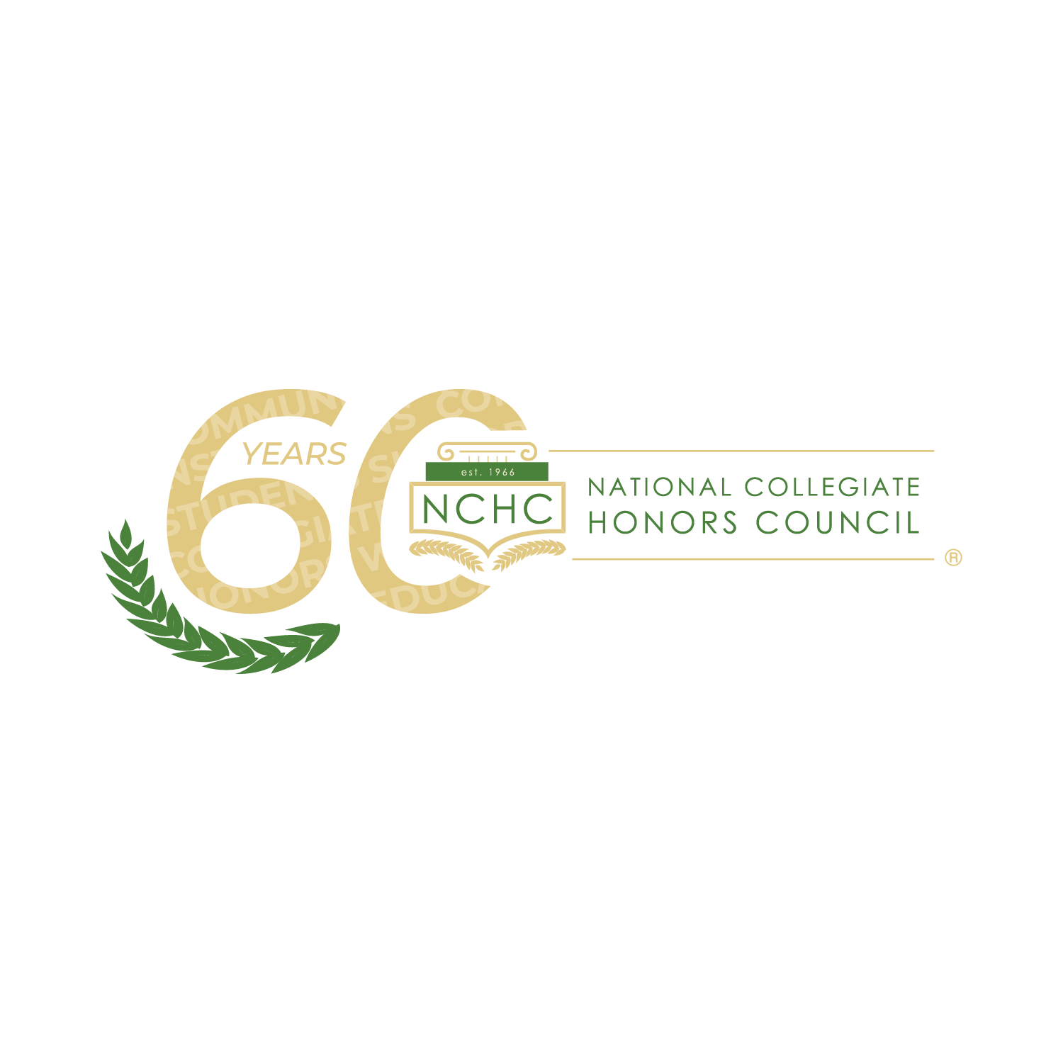 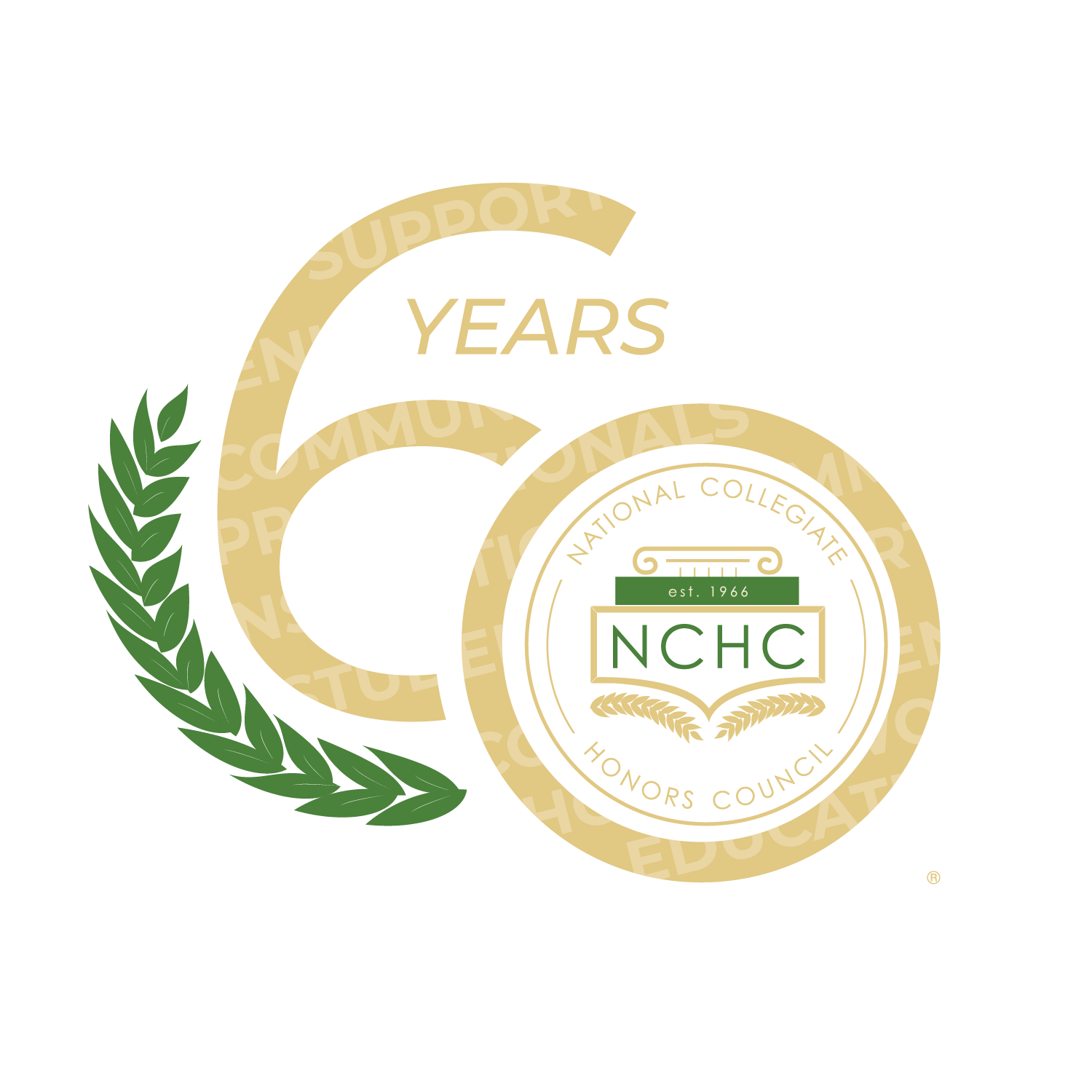 
Design StatementDesigning a new edition of an existing logo is deceivingly difficult. Established logos—especially for an organization like NCHC—are simple, precise, clean, refined, and perfectly balanced. Every element serves a purpose, and even a small change risks disrupting that balance. So how could I possibly add to such a well-balanced design, making it look like it belongs, but also stand out enough to mark a special milestone? I knew right away I couldn’t introduce new colors or fonts which is why I started by adding the “60 Years” in gold. At first, the addition stood apart from the logo, but I wanted new and existing logos to interact. This led me to integrate the original logo into the zero of the “60” on both the seal and the main logo. Once I added the gold element, though, the color balance felt off as there was too much gold. To restore harmony, I added a green laurel branch to the lower left of the 6. This laurel, a classic symbol of achievement, is already present in the existing logo. Its placement ties the design back to NCHC’s established identity and keeps the overall “vibe” consistent. Even then, I felt the anniversary logo needed a deeper connection to NCHC’s mission. The challenge was doing this without overwhelming the clean look I had just restored. My solution was a faint overlay of words drawn from the NCHC mission statement: community, students, honor, education, and more. For someone unfamiliar with NCHC, the words might go unnoticed, but for those who know the organization, they carry a deep meaning. In the end, this design came to be a true 60-year edition of the logo: still simple and precise, but with added layers of symbolism that celebrate both NCHC’s history and its mission. |
5/15/2026 » 5/22/2026
Partners in the Parks: Capitol Reef National Park
5/18/2026 » 5/23/2026
Partners in the Parks: Acadia National Park